Making of the Earsham Street Deli mural
How i designed, handpainted and gilded a mural for Earsham Street Delicatessen in Snape Maltings, Suffolk
CLIENTS BRIEF:
I was contacted by Michelle in the summer of 2022 to make some signage for the new branch of Earsham Street Delicatessen in Snape Maltings. There were a few signs that needed her current branding on that needed to advertise her store from the outside but she also pointed out a wall on the inside that she wanted a mural on. It was a large white painted brick wall in the hallway entrance to the new shop. I asked her if she had anything she wanted me to include in the sign and she showed me the sage green colour that she included in her branding. She also sent me her current logo by email.
I could already see in my mind that a large circular mural would look good in this space. Her branding is a modern rectangular shape and with considering the historical provenance of the Snape Maltings I asked her if she minded me playing around with her design. It was important for me to check that with her because I didn’t want to go off brand without her permission but I thought the mix of the Victorian Snape Maltings and her delicatessen, a job which also has historical meaning, could create a interesting connection.
The meeting concluded with me sharing my gilding obsession with Michelle. Her eyes lit up when I showed her the book of gold leaf I had with me. I think then she noticed my eyes light up too and she said, yes to everything you are thinking. Show me what you would do, I trust your opinion. I felt really excited then and knew I was going to put everything I had into making something really special for her.
DESIGNING:
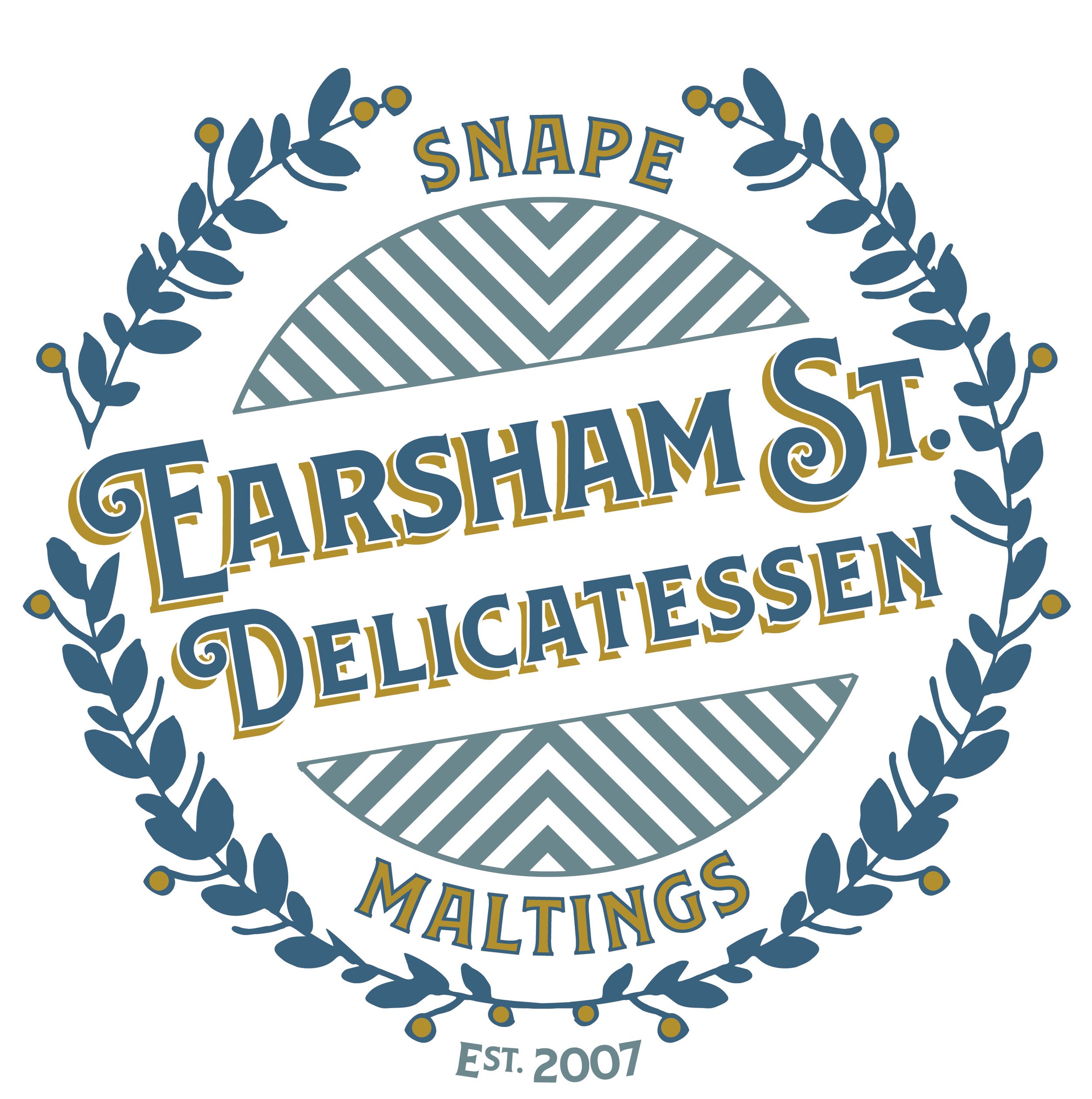
I kept getting flashes of old branding in my head so I played around with some different aspects from them. I really liked the Cadburys font and with the link to food in the delicatessen I thought that would fit the theme well. On Illustrator I wrote out the words “ Earsham Street Delicatessen” in Cadburys-style lettering and played around with making the Street into St and having it on one line versus two and capitalisation until I found a layout that felt right.


Next I knew I wanted the design to fit into a circle so I put some around the text. I thought the circles were a bit plain so I thought to continue the food theme I would try some vine leaves. These didn’t quite feel right as they were over complicating the design and stealing the show away from the most important thing, the name and so I simplified the plant around the edge. I wanted to also bring the words “ Snape Maltings” into the design as I wanted to point out this new branch location and add an established date “Est.2007” as older companies would do. This took a bit of balancing but eventually I had a layout I really liked. Last of all I brought some chevrons in to fill the spaces in-between and make it a cohesive design. On to the colouring!
I knew I was going to use the sage green of Michelle’s current branding and the gold as a highlights for the design but it was missing another colour. I really liked the idea of a powdery midnight blue to set the design off so I put some different colour-ways together to show Michelle. We through a few options but eventually settled on the blue, green and gold mix and so it was time to paint!

PAINTING & GILDING:
As the job was going to be inside and I wanted a matt look for the colour, I got the green and blue paints colour-matched in water-based interior emulsions. I was also a little concerned about my gold size absorbing into the brickwork and not creating a nice smooth gold so I decided to take my favourite Zinsser BIN 123 primer to create a barrier between my size and the wall. I put the layout up in chalk, painted the colours in and the primer and finished off by gilding the gold highlights. You can see the process in my video here.
FILMING:
I never really think too in depth about how to film my work but I really love making them and treating them as part of the process. I think a lot of people these days worry about how to get “content” but I think if you treat it the same way as you treat any art project and make it fun then it wont feel laborious.
For this one I threw a few options in my bag: my phone, a charger, a flexible phone holder that can clip onto surfaces and a mini tripod. This is probably the most I have ever taken with me! I don’t plan shots before hand. For this one I just set it up on the phone holder and clipped it to a pipe on the wall and then occasionally I took it down to shoot some close ups by hand or by resting it on the mini tripod. It was a busy day with people walking into the shop so I actually thought my footage might not come out too well but because the video is so sped up you end up not even seeing them. The only thing I try to do while filming is get a few angles so its not too boring for the viewer and make sure I take a lot of final reveal shots from different angles and styles so that people can clearly see what I created. I like editing my own videos and I also enjoy getting some put together for me when I am busy. I was having a busy summer and I wanted it to look professional so I sent it out to my editor - www.londonfilmeditor.com